


The Book Cover Arms Race
Or, Why I Design My Own Covers

Remember when book covers used to look like this:

I do. My father’s bookshelves were full of books with covers like this. And these covers did the job. They told you what you needed to know. The title, the author, the tagline, the publisher, the price. Do we really need more than this?
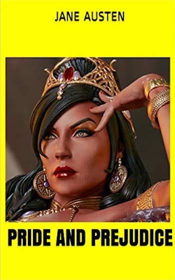
Do we really need this:

What is that, anyway? It’s a striking image, I suppose, but it looks more like a second-rate Dr. Who episode than a classic novel. Daisy was an alien! This one shows up on all kinds of best book cover lists but, to my eye, it is garish and has nothing to do with the book.
Of course, if they make a movie, we have to have this:

And then for the seedier crowd, we have to have this:

It has all the elements: bare chests, a gun, the word “sinful.” A perfect reflection of the novel. Sam Spade solves the whole thing when the cops are stumped.
It is to wonder that the seedier crowd are reading Gatsby in the first place, but then, the taste of the seedier crowd has coarsened over the years.
This one was apparently designed for Orwell’s The Invisible Man:

I guess they went with this version instead:

Oh, wait, I get it, its a metaphor! Gatsby is an empty suit!
Spare me.
Of all the ones I found when I Googled “Great Gatsby Book Covers”, I think this is the one I like best.

It is simple. It’s a nice picture. The text is clear. The mood is appropriate. It’s not shouting. Honestly, I’d still prefer the one with the two orange stripes and the bold black letters. But this is not bad. One will quickly turn past it to start reading, rather than staring at it in artistic rapture, and that, to me, is the point. It is a cover, it is supposed to lead us on into the book, not arrest us and hold us transfixed.
If you Google for resources on designing your own book cover, you will be told, over and over again, by companies who provide services to authors (like, say, designing book covers), that you must never ever under any circumstances design your own book cover. And, yes, there are some pretty atrocious amateurish book covers out there.
The above is cribbed from the Lit Hub list of worst book covers for literary classics and I presume it comes from someone who doesn’t speak English throwing up 99 cent e-books on Amazon. But I trust I make my point. Bad covers can be really bad.
On the other hand, truly great covers are rare. And the truly great are almost always simple. I love this one:

Pay a designer to produce a cover for your self-published book, though, and you are more likely to get something like this:
Now it undoubtedly takes great technical skill to execute something like that. I certainly couldn’t do it. But it is too much. It is shouting where it should whisper. So is this:

And this:
: McPhail, Melissa: 9780990629160: Amazon.com: Books")
And this:

Each to their own taste, but this kind of stuff is not to mine. And I am going to have to look at my book covers far more often than any reader ever will. So this is not for me.
My apologies to the authors and designers of the above covers, by the way, for singling them out. I picked them off a page of Google image results for a search for “fantasy book covers.” They are not bad examples of that genre. Rather, they are entirely typical of it. That is my point. My complaint is not about poor execution. My complaint is about the prevalent style of which these are no doubt sterling examples. It is the style I can’t abide.
I would consider paying for someone to design a cover for me if it did not seem that all the covers that the professional designers-for-hire are producing are these technically accomplished but furiously overwrought concoctions. (If you doubt that these are typical, there are over 19,000 premade book covers to browse through here. And no I didn’t check them all. Maybe they are not all garish and overwrought. Find one that isn’t, if you have the time.)
I might consider paying someone to design a cover for me if they could do me something like this:

Or this:

Or this:

But I don’t see much prospect of that. Book cover designers seem to be in a war to overlay the greatest number of images with the most complex and garish lighting effects. “Striking” seems to be the goal in every case, and “striking” is pursued by means of ever more complex designs and lighting effects.
The result is that when you see them all together, as in a Book Funnel promo, for example, nothing stands out because they are all shouting at once. As. W. S. Gilbert remarked, “When everybody’s somebody then no one’s anybody.”
Personally, I think the most striking covers on this page are those for Jurassic Park, Brideshead Revisited, and the original Penguin The Great Gatsby. The truly striking examples are not loud and complex but quiet and simple. But creating those requires a rare gift, and I suspect those who have it are not in my budget.
Which is why I do my own covers. I’m neither a designer nor an artist, so I stick to text over a simple picture or text accompanied by a picture. A good designer could doubtless do these simple things much better than I can. I flatter myself that I know enough to not make something too amateurish or hideous. But I know I could not live with the type of cover that the designers-for-hire seem to produce these days. Nor would I know how to find one that was willing and able to do something different for a reasonable fee.
Here is what I am working on for the cover of Lady Isabel and the Elf Knight, which I will be releasing soon:

I’m not sure about the font yet. It’s amazing how many fonts there are in the world and yet you can look through hundreds and not be satisfied. Anyway, I welcome any thoughts or comments, on this cover in particular, or covers in general.
Talking of Lady Isabel and the Elf Knight and of Book Funnel, I am participating in yet another promo and the “reader magnet” for this one is an excerpt from Lady Isabel and the Elf Knight. If you want an advanced look, therefore, go check it out. https://books.bookfunnel.com/christiansff/a9alvlq33s As always, it helps my reputation on Book Funnel if you click through. I appreciate it.
i'm also partial to simpler covers. and some of those gatsby covers were downright creepy. it's amazing how the 'right' cover can become almost invisible as it seamlessly blends with the aesthetic of the book, while the wrong cover can become a turnoff before i even open it. one pet peeve of mine with covers is when the author's name is in a giant font so i mistake it for the title. i always assume this is compensation for something and pass on the book.
in defense of the fantasy covers (although they're often not to my taste either) they do serve as a nice shorthand for the genre of the book. as do those legions of covers featuring a photo of an anonymous woman walking away. (https://bookriot.com/ww2-era-women-book-covers/ )
it lets the reader know what to expect if they chose that sort of book before they even open it. sometimes i'm intrigued by a historical-sounding title, then i see the shirtless hunk on the cover and realize it's not quite the book i was imagining. nothing wrong with any of these books, but titles are often vague. i think of covers sort of like a genre's 'fashion sense' or style. they signal how a book sees itself and where it 'fits in' with its peers. as a reader, this comes in handy...
i am by no means a cover designer (i still have to design a proper cover for my own book!) but i am a graphic and editorial designer if that means anything... i like the cover! dicksee was always one of my favorites :-) great choice of font. have you considered a color for the line border? i'm wondering what it would look like in the dark 'gold/brass' from the ornament on the horse's reins? (and i would probably use the same color at a 50%-65% tint for the title, etc.) anyway, looks good as is, just a thought... nice job!
Depends a lot on whether a cover is meant to grab people's attention, or be a proper accompaniment to the text itself. Ideally it does both, of course.
Talking of BookFunnel promos and their tendency towards being walls of glowy magical women, I recently updated my Tales from the Triverse cover from its original quite sparse style (the 3 rotated planets on a plain background - much more like the old-style Penguin classics) and shifted over to a more photoreal, hyper-coloured eye-catching thing.
Result? I'm getting more downloads now from the promos. I like both covers a lot, but it'll be interesting to see if this pattern continues, or whether it was a coincidence.